GO Rainmaker
All About This Project
Client: GO Rainmaker
Category: Graphics
For GO Rainmaker, as they started their new family business they requested a logo to capture the essence of what they do. Their business focuses on manufacturing and providing high quality cleaning products, such as vinegars, for companies that need assistance with distribution and production.
The overall branding was originally requested to meet three main criteria: clean, organic, and modern. The client also desired their branding to possess cool colors such as blues and grays as this palette is their personal preference and what they believe to represent their products most.
With all of this in mind I played with the idea of using eco-friendly iconography since this was a main selling point for the client, however as I pushed forward I steered the design to remain more simple and clean so that the design will avoid being limited visually as they grow and expand their business.
I first began work with pencil and paper and then brought everything into Adobe Illustrator where I finalized the design! Upon finalization I provided all of the needed files for GO Rainmaker and a quick style guide for the client to use when needed.
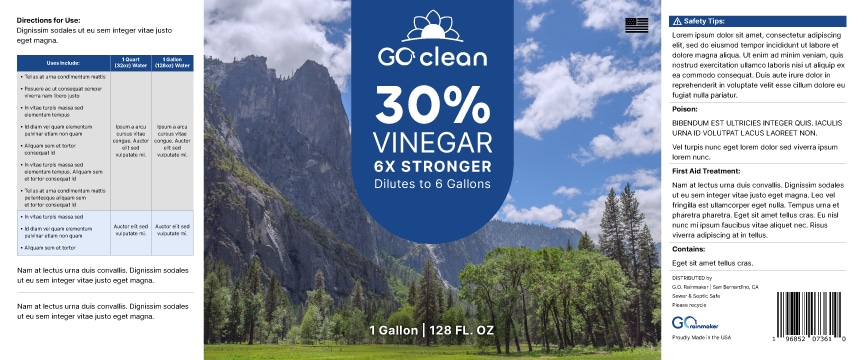
Later, once this main logo was completed, it was later translated into a product logo which was used for the companies first line of cleaning vinegars. Below shows how the final altered product logo and product label are displayed and used for the vinegars as well as the final main company logo and the process towards designing this.
Graphics Created
Logo Sketches

Logo Drafts

Final Logo


Product Label Mockup

GO Clean Product Label


